

Chart Time: Hourly Temperature decay and power inputs.

Entry posted by SteamyTea in Hourly Temperature Decay and Power usage: Statistics Heavy
3763 views
Prompted by @haddock's query here:
and my few charts to show what has happened in my house, I have finally got all my data together and after looking at dozens of charts, have reduced it to two that show the most useful information about my house cooling, or heating.
Initially thinking that the difference between internal and external temperatures was the best base to chart against, I soon realised that it shows hard to understand results i.e. a larger number, the colder it is. Then it struck me that as I was looking at the slope of the data points for °C/hour change in internal temperature, temperature difference was built in i.e. colder outside, the faster the house cools. Real scientists would be talking about 'energy forcing' which cover all energy inputs because of the Conservation of Energy: Energy cannot be created, only change its form.
But enough of that, the rest is statistics.
Without going into too much detail about data error checking, rounding and discarding data, the data points for the last 4 years were reduced to about 500,000 from about 300,000,000. Or basically data collected every 6 seconds reduced to data for every hour.
The data eventually used was Year, Month, Hour, External Temperature, Internal Temperature, Power and Zero Power. Other fields were created i.e. Week Number and Maximum Power, but these remain unused at the moment.
From that data it was quite easy to create hourly temperature slopes [°C/h], just take the last hours temperature away from the current hours temperature. If it is positive, it has got warmer, negative, colder. Power data was averaged (mean) over each hour.
If there was an error because of missing data, or misreported data, then that was filtered out and will show up in a lower data point count but can be corrected with the Standard Error of the Mean. This left 139,165 usable data point out of 140,268, not perfect, but quite usable.
There was one other set of derived data that was discarded, and this was extreme temperature slope values. Generally, the majority of the data points for the temperature slope was between -0.4°C/h and 0.4°C/h. Occasionally a slope that was into the major integers appeared. Now it is very possible to get cooling of 2°C/hour by leaving the window open, similarly a large increase in room temperature could be caused by letting a cake cool under the temperature data collector (I actually did this and wondered why the room temperature was reported as 27°C, in November). This data was therefore filtered to exclude anything outside of the range of >=-0.5°C/h and <=0.5°C/h. Again, this can be justified as the Sample Count and the Standard Error can be used to adjust the results.
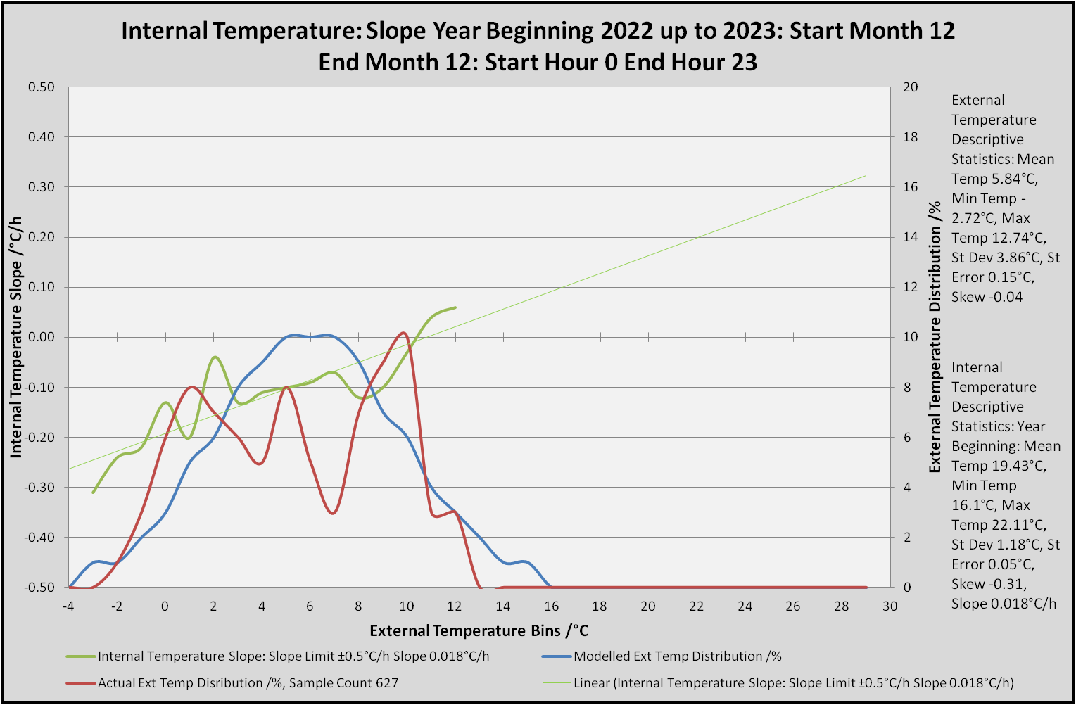
Other descriptive statistics were used to help explain what is happening. Minimums, Maximums, Standard Deviation, Skew and Slope were calculated on the relevant data ranges. External Temperature Distribution, as a percentage, was calculated as a Normal Distribution as well as empirically from the data. This was done as a data check but also highlights the variations in the temperatures and the associated skew i.e. long tail to the left [negative skew], the modelled data shows no skew.
Now that the dull bit is over, some charts.
The first chart is all months and all hours for the years 2019, 2020, 2021 and 2022.

As expected, the mean slope, the actual change in rate of the house warming up and cooling down, is very close to 0°C/h. It also shows that at very low external temperatures, the house cools faster i.e. -0.3°C/hour when it is -3°C outside. Around the mean external temperature of 12°C there is house cooling of -0.06°C/h, which is basically no change. The house does not start to warm up, until the external temperature is 23°C, but as the Temperature Distributions show, that does not happen very often down here in Cornwall, less than 1% of the time after rounding.
This does not mean that the house does not get hot, at one stage, it was at 29.43°C, a proper temperature and one I can easily get used. Taking the internal temperature standard deviation into account, 90% of the time, the house temperature is 20°C ±4°C. Lower temperatures were probably when I was away, higher temperatures were probably during the two severe heat warnings we have had down here.
Power usage, which is a bit peculiar in a house with storage heaters, often show a warmer temperature in the mornings and it being cooler in the evenings. As the data can be filtered by hour, the next three charts will show all times over the last four years, then after the heating has finished during the first two months of the year, up to near enough local noon, then local 14:00 to 19:00.
The x-axis is Internal Temperature Slope, the °C/h.
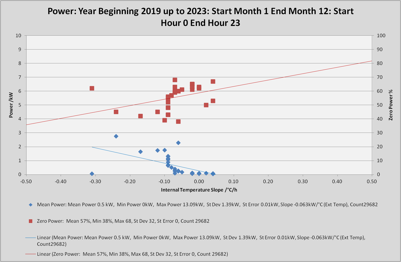
The above chart shows that as the internal temperature change reduces, less overall energy is needed to keep the house a a stable temperature. This is backed up by the times the house is using Zero Energy. The Zero Power outlier on the left corresponds with an almost zero energy usage, and a greater temperature drop of just over -0.3°C/h, so the house was probably empty then.
The 7AM up to 1PM [6 hours] chart during January and February which are known heating months.

This shows a very different picture. The mean power is now 0.1 kW [100W], down from 0.5 kW [500W] because there is no heating input, but the house is hardly changing in temperature with most of the data points clustered between -0.02 to 0.05°C/h. The outliers on the right are probably oven usage.
The 2PM to 7PM [6 hours] chart for the same period.
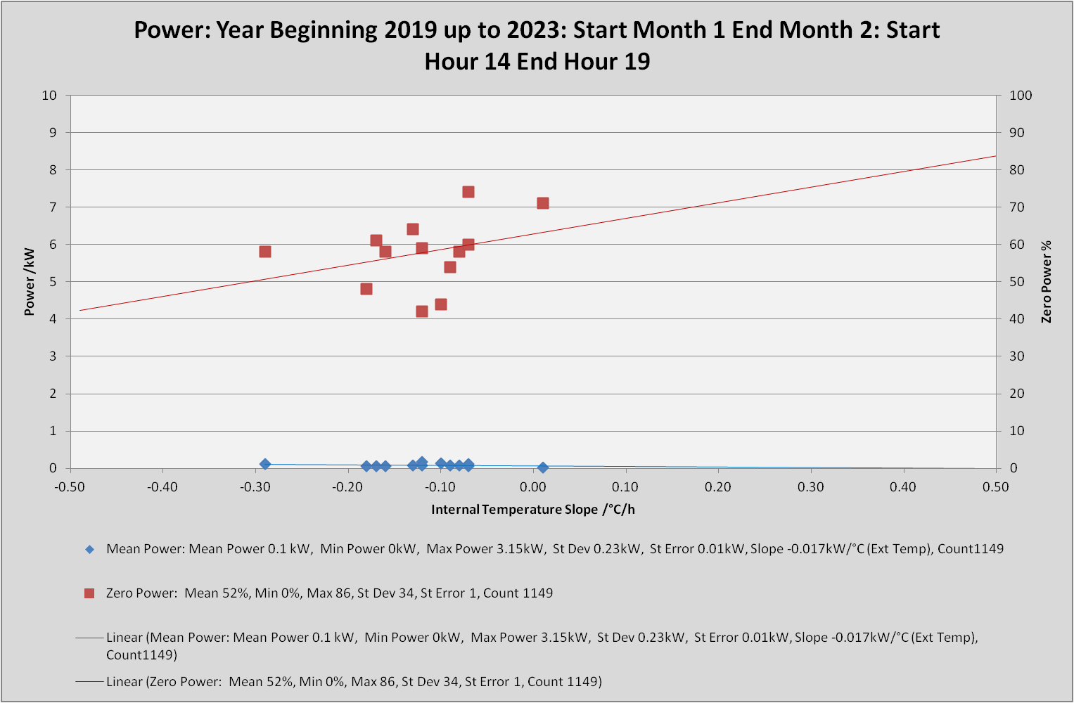
As the storage heaters have now not been recharged for at least 8 Hours and up to 14 hours, it is unsurprising that the house is starting to cool a bit more, with the energy inputs stretched out a bit more between -0.28 to 0.2°C/h, clustering between -0.18 to 0.07°C/h. This is highlighted better on the next two charts which cover the same time periods.
7AM to 1PM [6 hours] chart.

As the temperature slope is negative, it shows that the house is cooling at a rate of -0.003°C/h, which is basically stable and shows that the storage heaters are keeping the place warm, 19.8°C, with a greater warming affect the colder the outside temperature is.
The 2PM to 7PM [6 hours] chart

As mentioned above, because the storage heaters have not been charged up for many hours [between 8 and 14 hours], it is not a surprise that the house is cooling.
What is a surprise is that the relative cooling is so low at 0.015°C/h. Part of this will be because the internal temperature has risen slightly to 20°C [my target temperature]. Allowing for the increase in the Standard Deviation of 1.32°C, up from 1.29°C in the morning, there is, in reality, no temperature change, and certainty not one that is noticeable.
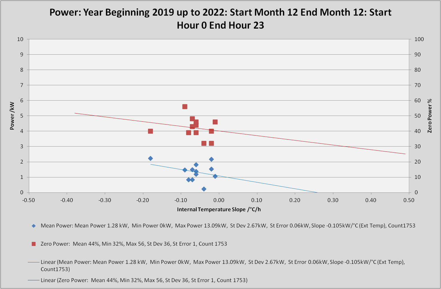
Now that is all over, I am going to show four charts that highlight what adding secondary glazing and fixing the leaky back door have done.
These are for December. The first two are the temperature slope, second two are the power usage.
December 2019, 2020, 2021 Temperature Slope chart.

December 2022 Temperature Slope chart.
Pre improvements was cooler in the house even though the mean external temperature was 8.3°C as opposed to 5.8°C in December 2022. The range of temperatures where much greater as well in December 2022.
December 2019, 2020, 2021 Power Usage chart.
December 2022 Power Usage chart.
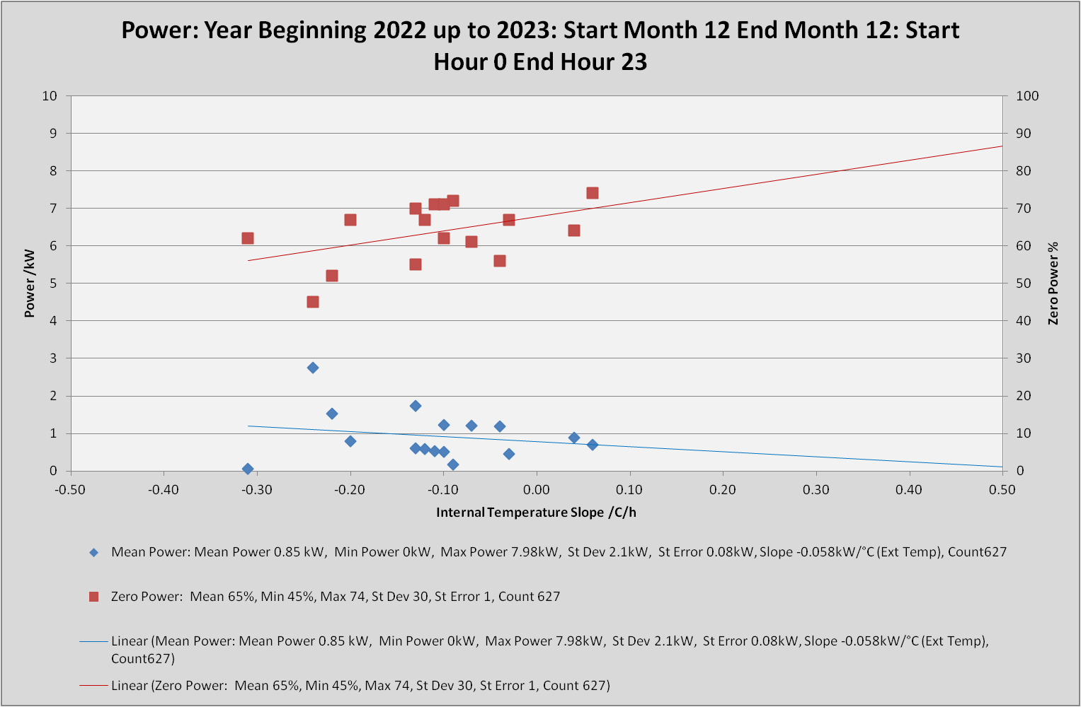
Mean power is now 0.85 kW, down from 1.28kW, a reduction of 0.43 kW or 320 kWh for the month.
The slope, on these power charts, shows the change in power needed for every °C change in external temperature.
That has gone from 100W/°C to 60W/°C.
Airtightness and insulation really work, and I am still getting the benefit of those improvements.
Edited by SteamyTea
-
 2
2
2 Comments
Recommended Comments
Create an account or sign in to comment
You need to be a member in order to leave a comment
Create an account
Sign up for a new account in our community. It's easy!
Register a new accountSign in
Already have an account? Sign in here.
Sign In Now